Drexel CCI Web App Design Competition
Drexel CCI Web App Design Competition
Drexel CCI Web App Design Competition
Drexel University
Drexel University
(
(
2023
2023
)
)
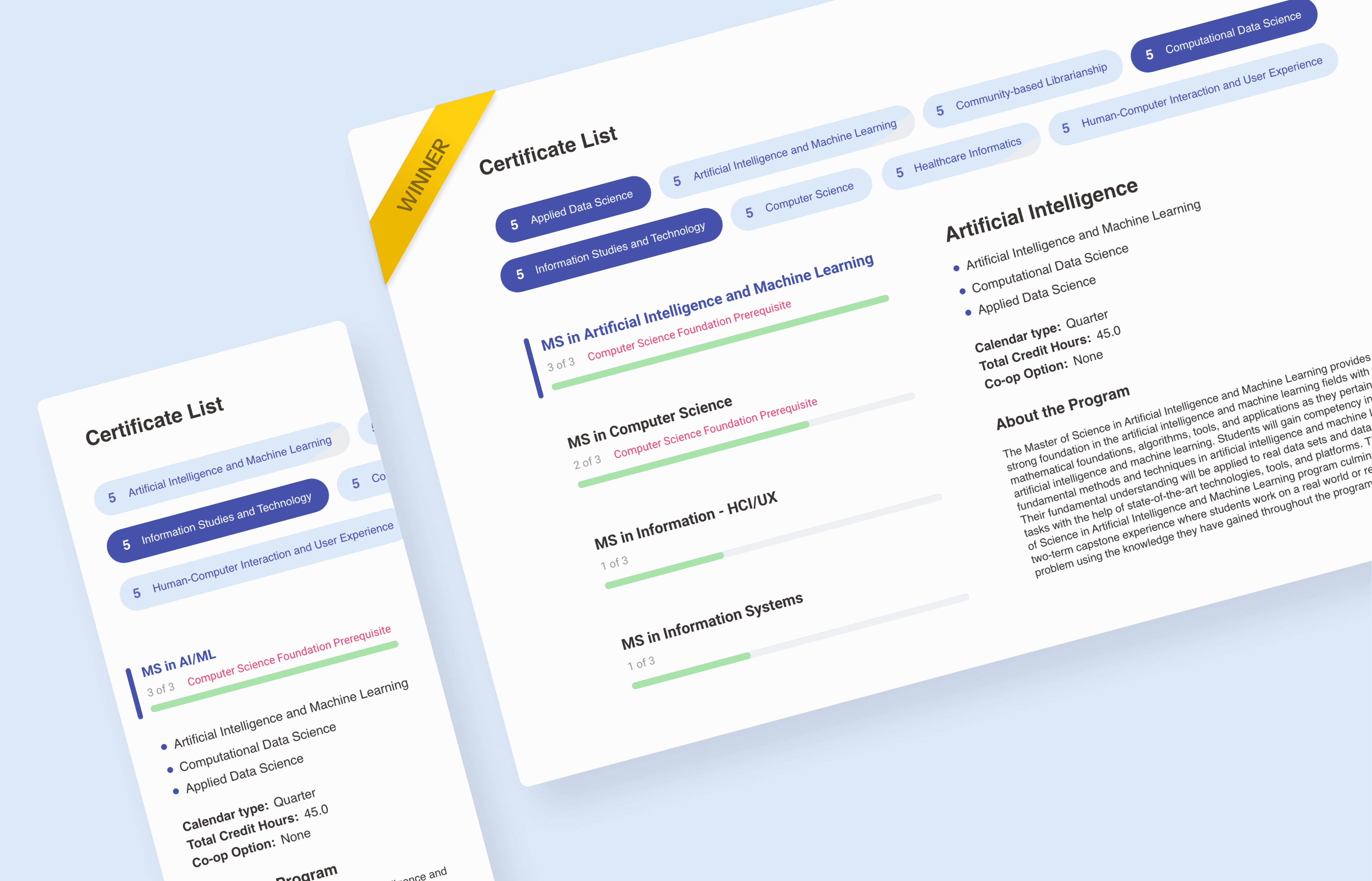


A web-based system that allows users to search University Certificate Programs. First place winner out of 60+ submissions
A web-based system that allows users to search University Certificate Programs. First place winner out of 60+ submissions
A web-based system that allows users to search University Certificate Programs. First place winner out of 60+ submissions
Client
Client
Drexel University
Drexel University
Timeline
Timeline
1 month
1 month
Devices
Devices
Desktop, Tablet, Mobile
Desktop, Tablet, Mobile
Team
Team
Solo UI/UX Designer
Solo UI/UX Designer
Services
Services
UI/UX Design
UI/UX Design
,
,
UX Research
UX Research
,
,


The problem
The problem
Students pursuing higher education at Drexel face challenges in customizing their academic paths to align with their specific career and educational goals.
Currently, students lack an intuitive tool that allows them to explore and combine certificate programs into a master’s degree. This results in difficulty planning an academic route that offers both flexibility and clear guidance toward obtaining a full degree.
The solution
The solution
Design a web app that allows students to seamlessly “mix and match” certificate programs, offering a clear visualization of possible master’s degrees they can achieve based on their selected combination of certificates.
The interface will be intuitive, enabling users to browse, view, and select certificate options. When three certificates are chosen, the tool will automatically display the master’s degree(s) available from the combination, providing flexibility and informed decision-making to students.


Research
Research


Interviews
Interviews
At the discovery phase of my project, I conducted interviews with people between the ages of 21 and 35 who have the undergrad degree.
I asked respondents a few questions regarding their attitude to the admission process, then I let them use the current website and asked to try to choose the degree. After it, I asked about their overall impression and challenges they faced using the current site. I found patterns in users perceptions and tasks and aggregated my findings in the form of a persona.
Key Findings
Key Findings


Persona
Persona
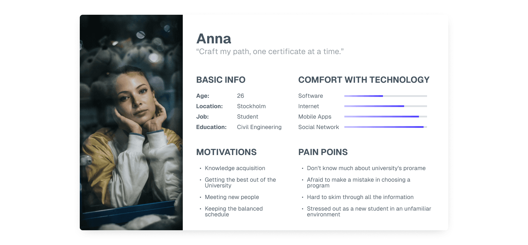
Based on the interviews I set up a user persona. Anna (26) is a potential graduate student at Drexel University.
She's still poorly guided in programs, but needs to choose certificates for starting a master's program. I showed her background, motivations and pain points. It was also important to show her knowledge of technology needs. I referred to the persona throughout the entire product development process.


Ideation
Ideation
Sketches
Sketches
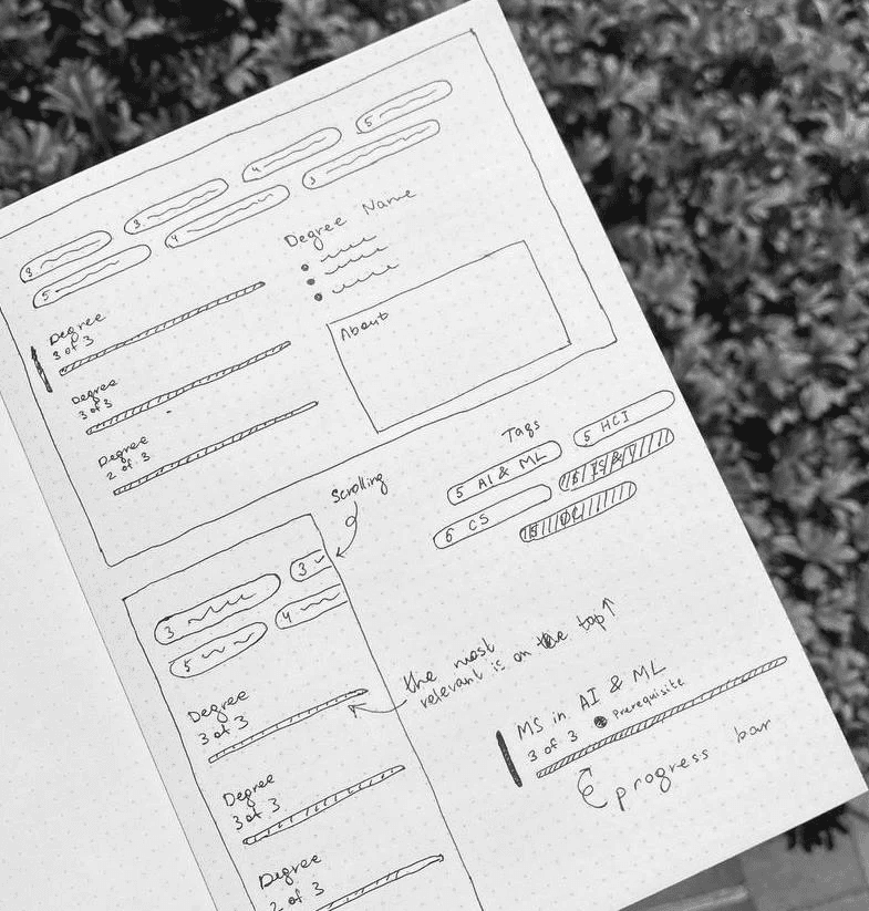
After summarizing the information from the research, It was the time to sketching my ideas.
As it turns out from the interviews, the admission process could be stressful for many students, so I didn't want to frighten them with even more obscurity. Otherwise, it may seem a little frustrating for people who haven’t been acquainted with fancy solutions before. The goal for me was to create a clear and simple interface using familiar elements like tags, lists and progress bars.
Mid-Fidelity Wireframes
Mid-Fidelity Wireframes
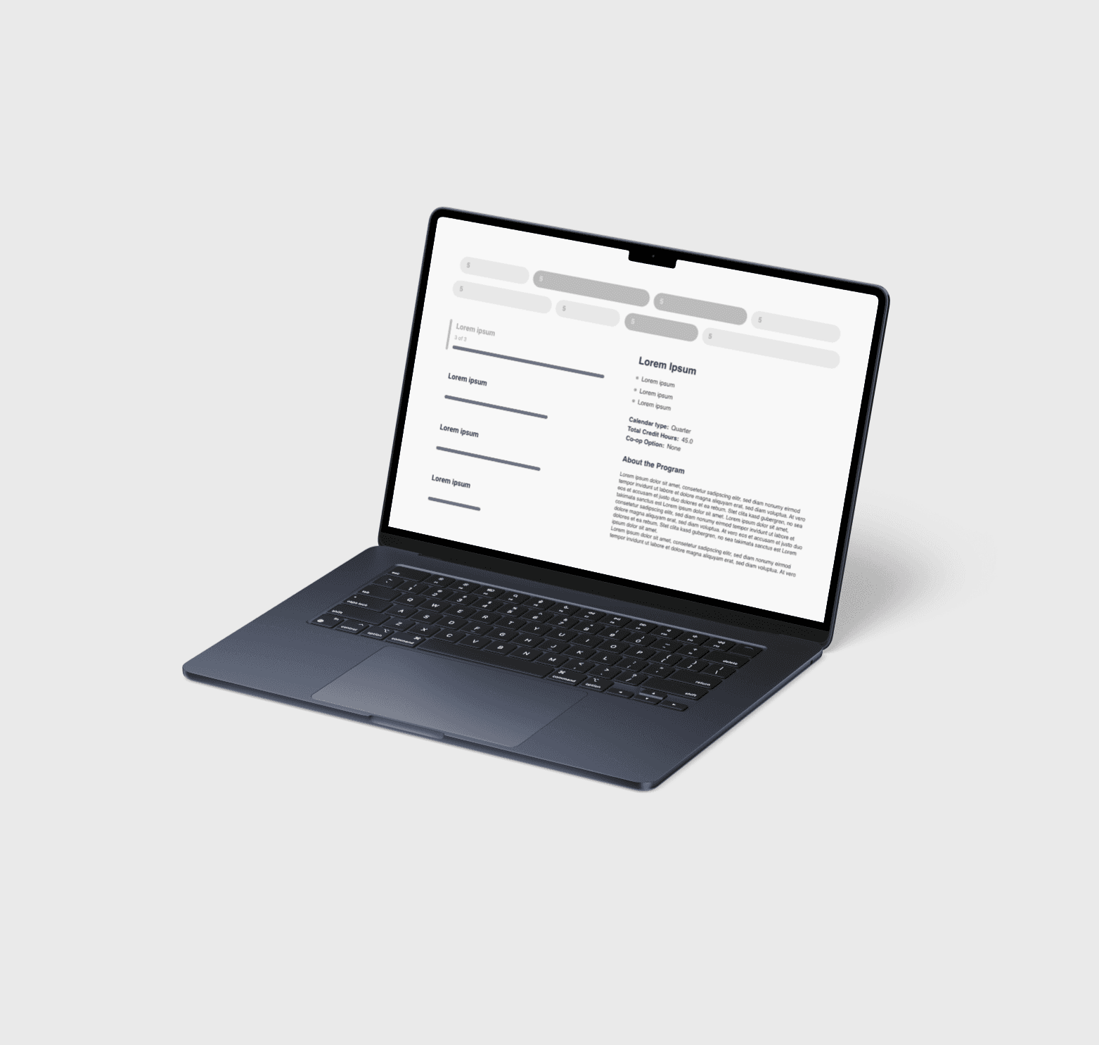
I developed more detailed wireframes to conduct early testing and make informed adjustments based on user feedback.
Using Axure, I transformed initial sketches into a structured digital prototype for clearer visualization and interaction.
I developed more detailed wireframes to conduct early testing and make informed adjustments based on user feedback.
Using Axure, I transformed initial sketches into a structured digital prototype for clearer visualization and interaction.




Test
Test
User Testing
User Testing
Before proceeding with the high-fidelity design, I conducted user testing to identify potential usability issues.
I shared the wireframes, scenario, and tasks with a classmate and asked for her feedback through a series of targeted questions. Based on her responses, I gathered valuable insights and made design adjustments accordingly.
Key Findings
Key Findings
These adjustments enhanced both the clarity and functionality of the interface before moving into the high-fidelity stage:
Positive Feedback: She appreciated the core concept and found the interface intuitive. The overall composition, design solutions, and tool functionality received positive reviews.
Improvements: The initial version lacked clarity in certain areas. I added a counter to display how many certificates the user had selected out of the required number and included a prerequisite warning under the degree options. Additionally, I implemented a slider to signal that each block of master's degrees is interactive and clickable.


Prototype
Prototype
Style Guide
Style Guide
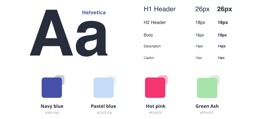
Balancing Neutrality with Strategic Accents for Clear Communication
I selected Helvetica for this project to emphasize its clean and neutral aesthetic. One of its key strengths is its ability to maintain simplicity without overwhelming the design.
For the color palette, I chose neutral blue tones as the primary colors, complemented by accents of green ash and bright fuchsia to highlight key elements and draw attention to important details.


Prototype
Prototype
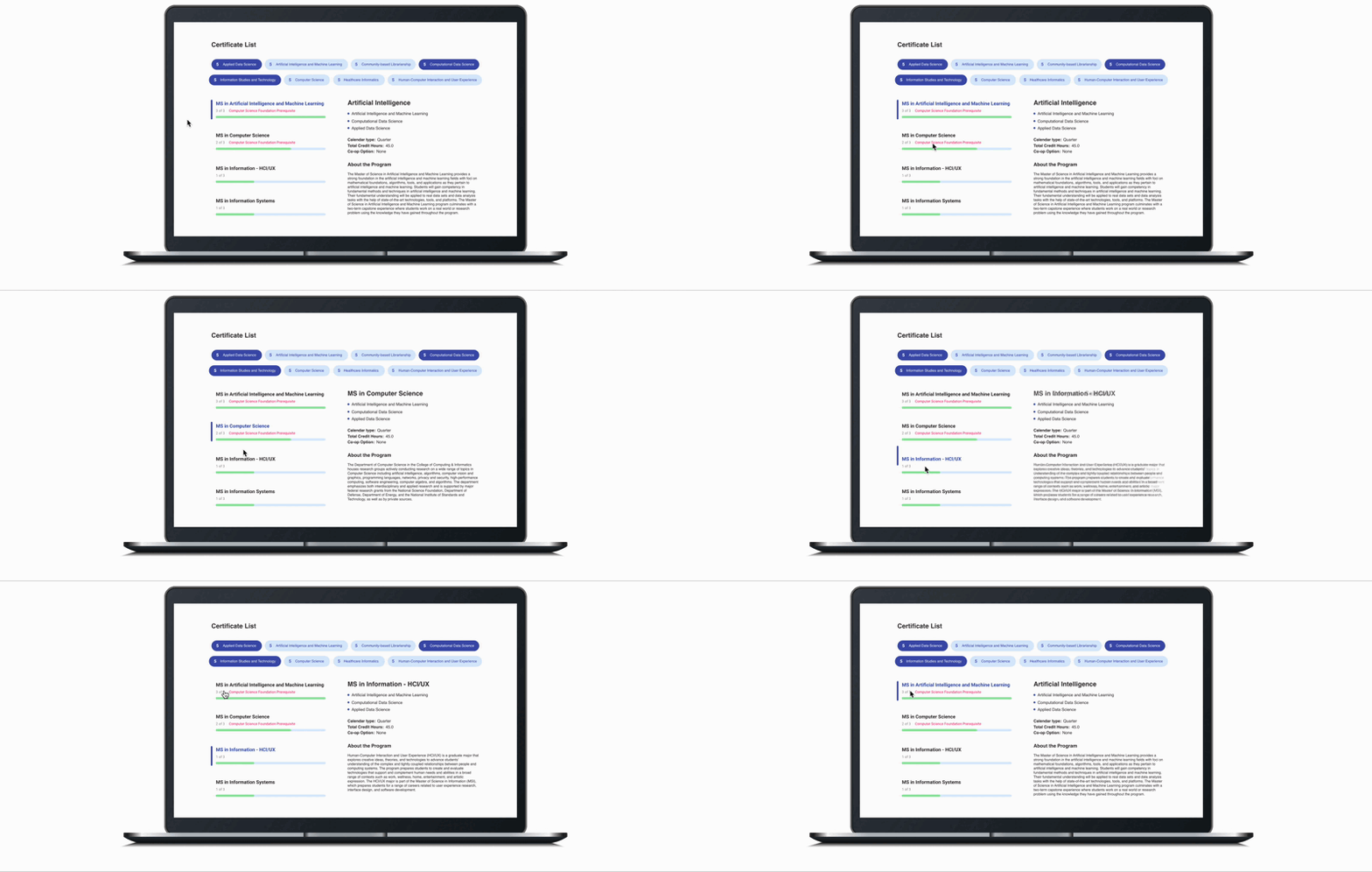
Balancing Neutrality with Strategic Accents for Clear Communication
I selected Helvetica for this project to emphasize its clean and neutral aesthetic. One of its key strengths is its ability to maintain simplicity without overwhelming the design.
For the color palette, I chose neutral blue tones as the primary colors, complemented by accents of green ash and bright fuchsia to highlight key elements and draw attention to important details.


Tags
Tags
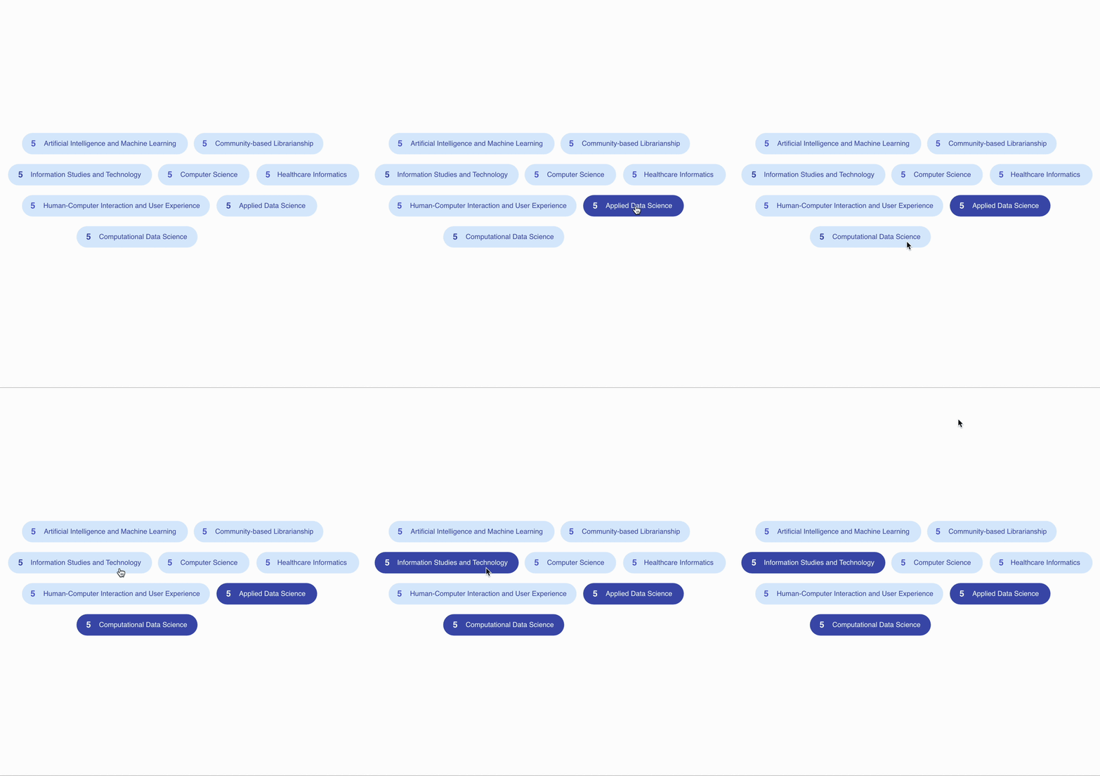
Balancing Neutrality with Strategic Accents for Clear Communication
I selected Helvetica for this project to emphasize its clean and neutral aesthetic. One of its key strengths is its ability to maintain simplicity without overwhelming the design.
For the color palette, I chose neutral blue tones as the primary colors, complemented by accents of green ash and bright fuchsia to highlight key elements and draw attention to important details.
Responsive Layout
Responsive Layout
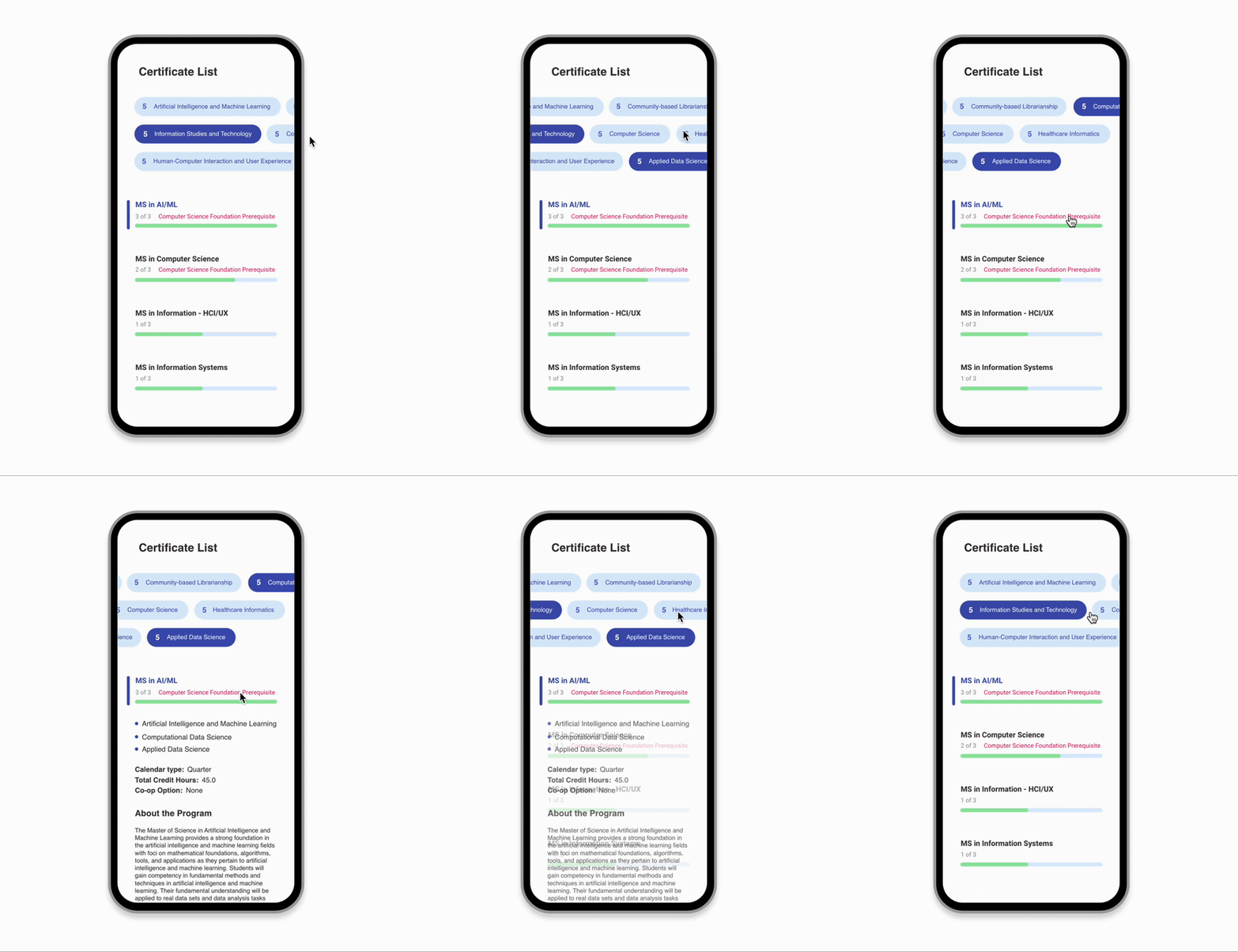
Balancing Neutrality with Strategic Accents for Clear Communication
I selected Helvetica for this project to emphasize its clean and neutral aesthetic. One of its key strengths is its ability to maintain simplicity without overwhelming the design.
For the color palette, I chose neutral blue tones as the primary colors, complemented by accents of green ash and bright fuchsia to highlight key elements and draw attention to important details.




What I learned
What I learned
This project taught me the importance of not being afraid of tight deadlines and working alone.
The competition gave me more self-confidence and inspired me to improve the presentation skills.
This project taught me the importance of not being afraid of tight deadlines and working alone.
The competition gave me more self-confidence and inspired me to improve the presentation skills.


/ What's next?
Now, when the design is approved, Drexel started to execute on the project. Once the app is fully interactive, it'd then be worth exploring additional features that would be possible to implement to our persona's needs.
Now, when the design is approved, Drexel started to execute on the project. Once the app is fully interactive, it'd then be worth exploring additional features that would be possible to implement to our persona's needs.
Now, when the design is approved, Drexel started to execute on the project. Once the app is fully interactive, it'd then be worth exploring additional features that would be possible to implement to our persona's needs.
My work has been featured by:
Let’s chat
Contact me today at egarafieva97@gmail.com, and let's start transforming your ideas into extraordinary digital experiences.
Site designed and built by Ellie Garafieva.
Copyright © 2024. All rights reserved.
My work has been featured by:


Let’s chat
Contact me today at egarafieva97@gmail.com, and let's start transforming your ideas into extraordinary digital experiences.
Site designed and built by Ellie Garafieva.
Copyright © 2024. All rights reserved.
My work has been featured by:


Let’s chat
Contact me today at egarafieva97@gmail.com, and let's start transforming your ideas into extraordinary digital experiences.
Site designed and built by Ellie Garafieva.
Copyright © 2024. All rights reserved.
My work has been featured by:


Let’s chat
Contact me today at egarafieva97@gmail.com, and let's start transforming your ideas into extraordinary digital experiences.
Site designed and built by Ellie Garafieva.
Copyright © 2024. All rights reserved.